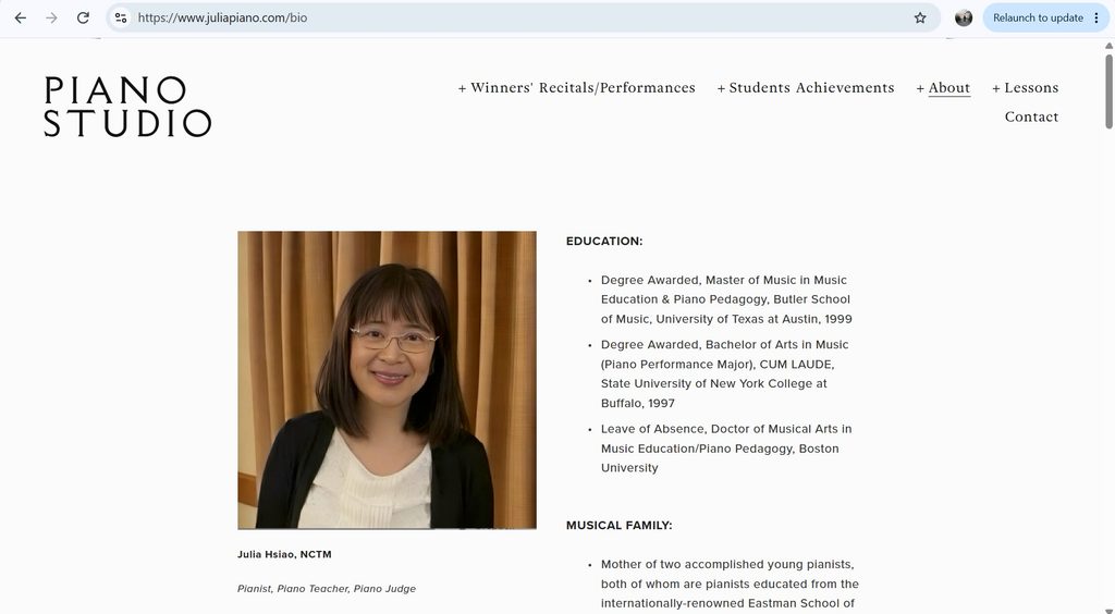
Poor Website:
https://www.juliapiano.com/bio
- Overall design
The overall design of this website is pretty bland. The main page has a large picture, the studio’s name, and a navigation bar, but nothing else. You cannot scroll down to see more content. On the pages with more content, the background is a bland white color. The text is in a small uninteresting font. There are large chunks of text with no pictures. On the bio page, there is a picture that seems awkwardly placed. The text on the page does not wrap around the picture. Instead, it is in a narrow column that stretches far down the page. This leaves an awkward white space on the left side of the page.
- Navigation
Navigation is also strange on this website. There is a navigation bar at the top of the screen, but all of the buttons lead to a blank page. To find any of the content, you have to hover over the buttons and click one of the items in the drop-down menu. One thing that I like about the menu is that the studio name is a link that takes you back to the home page.
- Functionality
The functionality of this page was not terrible; however, I did notice an issue with the gallery page. It took a longer to load than the rest of the website, and the pictures were a little slow in loading at first.
- Content quality
This teacher seems to have had a lot of experience. There are long pages of her students’ achievements. However, the “Protégé” page has some awkward grammar that almost seems like it was written by someone who has a different native language. There is a lot of information about the lady’s students and her own accomplishments. There are also pages explaining studio policies and lesson logistics. Unfortunately, under the tuition page, there is not a price for lessons listed.
- Site effectiveness
I think that this accomplished piano teacher could reach people much more effectively if she updated her website. Long pages of small text with no pictures and difficult navigation contribute to an ineffective website.
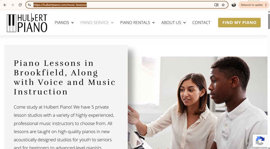
Good Website:
https://hulbertpiano.com/music-lessons/
- Overall Design:
This website is very visually pleasing and interesting. There is a mix of pictures, text, and even a video. The only design issue that I found was, surprisingly, on the home page. The text box runs off the page so that the words are cut off. The same issue is repeated on the piano rentals page. Besides this glaring issue, the rest of the website is very clean and professional.
- Navigation:
The navigation on this website is very easy to work with. There is a navigation bar at the top with smooth drop-down menus. The bottom of the page has helpful links as well. It is easy to find what you are looking for.
- Functionality
This website has incredibly good functionality. Even with many, many pages including pictures and videos, it loads very quickly and does not glitch.
- Content Quality
There is a lot of content on this website. Since it is well organized, it is easy to find out a lot of information about the company’s many employees and services. As well as offering music lessons, the website offers piano tuning services and information on how to care for your piano. It is clear from the content that the company has very knowledgeable and qualified employees.
- Overall Effectiveness
This site is well made and is quite effective. If the text box issue was resolved, it could have an even stronger impact. The design will help the website to have a low bounce rate, and the content will keep people coming back for more information.