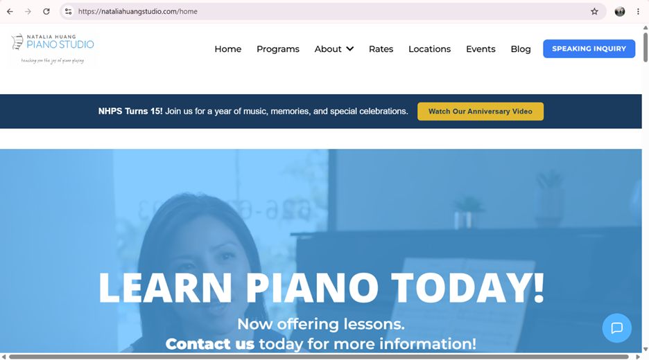
Good Website:
https://nataliahuangstudio.com/home
- Overall design
Overall, this website has a clean design. The design is consistent across the website. It uses the same fonts throughout various pages. Using a monochromatic color palate adds to the cohesion of the overall website. There are a lot of pictures, which adds to the visual interest of the website.
- Navigation
The navigation bar at the top of the website is clearly labeled and easy to use. There are additional helpful links at the bottom of the website to other pages on the site and to the studio’s social media accounts.
- Functionality
The site did not take too long to load, and the video on the main page works. The links in the navigation bar worked without issues. However, the buttons under “Rates” on the main page have problems. Once you click on a button other than the default selection, none of the buttons will allow you to select them. You cannot see the rates for any of the other studio locations. There are some animations on the main page that work smoothly without being tacky.
- Content quality
This website does a good job of having clear, helpful information for someone interested in enrolling in music lessons. There is even a page dedicated to studio policies. The rates for lessons are not clear, however, due to the functional issue with displaying prices for the different studio locations.
- Site effectiveness
This site would be effective in reaching someone who is looking for piano lessons for themselves or their children. The design is done in a way that does not turn people away. It has relevant content, and mostly clear information. The technical issue with displaying the prices is a glaring issue, but if that was fixed, the website would be very effective.
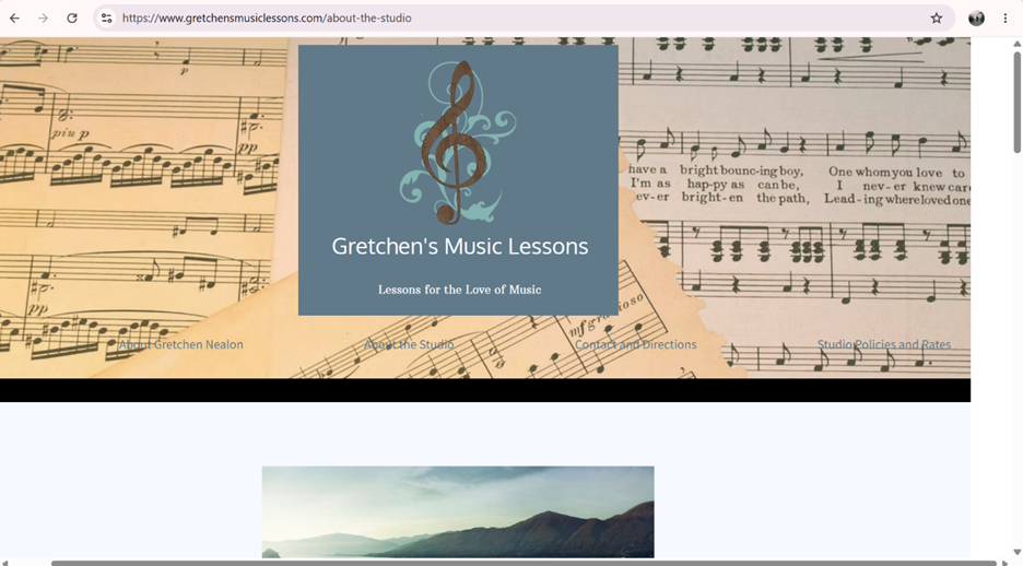
Poor Website:
https://www.gretchensmusiclessons.com
- Overall design
At first glance, this seems to be an aesthetic website. It has a lot of nice pictures and uses colors in a pleasing way. However, it has some issues. The main page almost fits in the screen, but there is a weird white space on the right side that shows up if you aren’t scrolling perfectly straight down. When you leave the home page, everything is oddly centered, even blocks of text.
- Navigation
This website is hard to navigate because the navigation bar is very hard to use. There are hyperlinks in a row, but they are on top of a busy picture, so they are difficult to notice or read. It would improve the website significantly to add a block of a solid color underneath the links to make them more readable. Also, the words in the footer were not hyperlinks, which was somewhat confusing.
- Functionality
This website is fairly functional. The links load quickly, and I didn’t find any that were broken.
- Content quality
The website includes the basic information about the studio, but there is not much content there. A lot of the writing feels awkward because some of the sentence structures are strange. Mainly, however, the writing seems awkward because it sounds like the author is writing about themselves in the third person. It seems that the lady running this studio has had good training and experience, and that her studio is well equipped with a variety of instruments. I would also change the section mentioning Skype to just say virtual lessons more generically, since not many people still use Skype.
- Site effectiveness
This site could use some work to make it more effective. The unclear navigation, awkward writing style, and odd design issues significantly decrease the site’s ability to reach its audience.